ΑΧΙΟΜ
Full brand identity system for AXIOM, a fictional independent institute located in Los Angeles dedicated to the intersection of art, science, and emergent technology. The project covers naming, brand strategy, visual identity, environmental signage, publications, digital presence, merchandise, and motion identity.
AXIOM is not a science museum. It is not a tech company with a gallery. It is something that does not yet have a category — a place where artists who code work alongside scientists who exhibit, where engineers make paintings and philosophers write software. The institute holds a permanent collection not of objects but of processes: archived experiments, generative artworks, biological installations, and algorithms treated as artistic works.
The name was chosen because it operates in both directions. In mathematics and logic, an axiom is a principle accepted as true without proof — the starting point of all thinking. In the philosophy of art, it is the conviction that keeps an artist moving. AXIOM refuses to choose between the two.


Visual Identity
A geometric square with three complete sides and a top horizontal line that stops abruptly at 65% of its expected length. At the stopping point, a small filled circle in Signal yellow-green marks the end. The symbol reads as a proof that was not finished — an experiment still in progress, a form that knows what it should be but stops where the unknown begins. The dot is not an error. It is a decision.
The dot is always rendered in Signal yellow-green (#E8FF00) regardless of the version or application. It is the one constant in the system.
Color Palette:
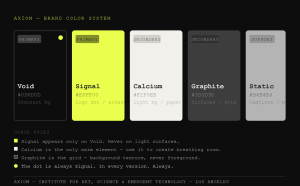
The logic of Void and Signal is intentionally violent. Near-black and electric yellow-green with no middle ground — the contrast between the unknown and the moment something becomes visible.
Typography: Aktiv Grotesk Extended Bold for headlines and display — scientific precision, wide stance, unapologetic. Söhne Regular/Light for body and UI — neutral, readable, makes no claim on attention. IBM Plex Mono Regular for data, coordinates, and technical text — honest, directly references computation.
The Fluid Visual System: Every application uses a background grid of fine horizontal and vertical lines in Graphite — like graph paper, like an oscilloscope screen, like a coordinate system. Content is placed on the grid but never follows it perfectly. The art and the text break the grid deliberately. Each exhibition introduces a temporary secondary accent color for its duration, then disappears. The core system — Void, Signal, Calcium — remains fixed.
Creativity is the key to success in the future, and primary education is where teachers can bring creativity in children at that level.
A. P. J. ABDUL KALAM